These brand guidelines will provide your team with the tools and guidance needed to accurately use the FuelCell Energy brand assets and content in your design and marketing materials. Follow these guidelines for all internal and external visual communications to create a distinctive look and feel that is immediately recognizable.
Our logo is a visual representation of our promise toward a carbon-neutral future.

Our symbol is a zero that’s assembled by our company initials—FCE. Never recreate the symbol; always use the electronic files provided.
This is our primary logo, also known as a “lockup.” It includes our full name: FuelCell Energy. This logo should be used for all primary communications. The primary lockup is composed of the symbol next to the stacked name. Use the primary lockup in every possible application. Never recreate logos; always use the electronic files provided.
The secondary lockup is horizontally oriented instead of stacked. Use this in horizontally oriented applications where the primary lockup absolutely will not work. Never recreate logos; always use the electronic files provided.
Primary—Gradient
The FuelCell Energy symbol is unique in that it should regularly appear in communications as a gradient. This foregrounds our dynamism and future orientation.
Secondary—Gray
When the primary gradient color is not allowed for use, the FuelCell Energy logo should appear in gray.
Tertiary—Black or White
Only when either the primary gradient color or secondary gray color is not allowed for use, the FuelCell Energy logo should appear in either black or white. In this instance, the symbol is the same color as the wordmark.

The minimum sizes of the FuelCell Energy primary lockup, secondary lockup and symbol are defined to prevent legibility and reproduction issues across FuelCell Energy’s brand touchpoints.
Primary: 0.325" tall/24px tall
Symbol: 0.2" tall/16px tall
Secondary: 0.2" tall/16px tall
The minimum clear space surrounding the primary and secondary lockups is determined by the height and width of the “C” in “FuelCell Energy.”

Primary Lockup Clear Space

Secondary Lockup Clear Space
Usage of FuelCell Energy's logo is kept simple by deploying the primary lockup on white whenever possible. The logo can additionally be reversed out of a brand color or out of a gradient.

To keep a consistent brand image, do not do any of the following with the FuelCell Energy logo:
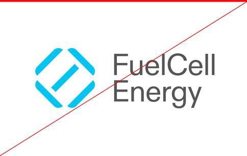
Do not add secondary brand colors to the logo.
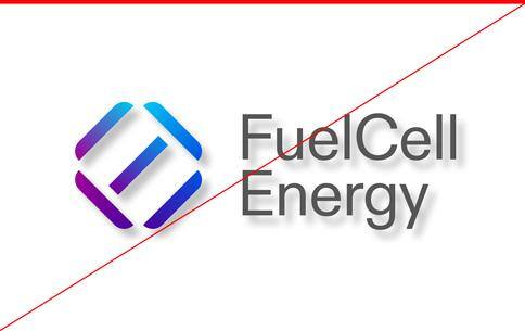
Do not add unnecessary effects or treatments to the logo.
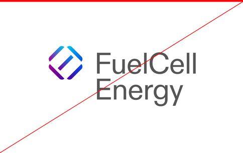
Do not rearrange the logo elements.
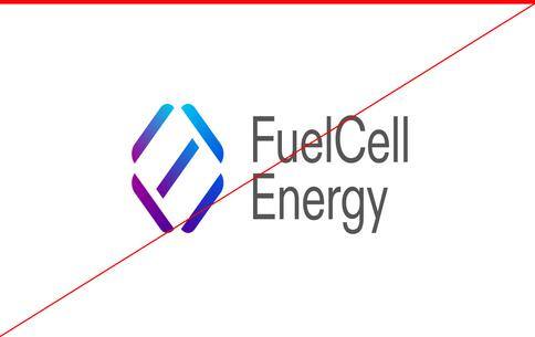
Do not squeeze the logo.
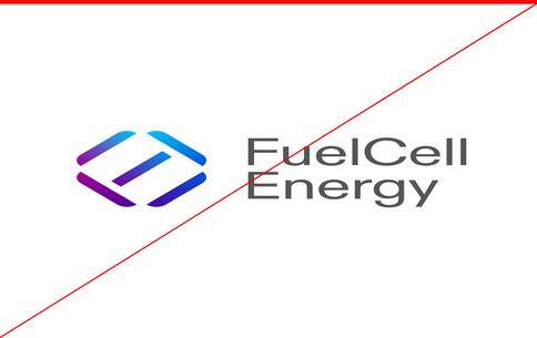
Do not stretch the logo.
Usage of FuelCell Energy’s logo is kept simple by deploying the primary lockup on white whenever possible. The logo can additionally be reversed out of a brand color or out of a gradient.

Full Color on White

White Reversed Out of Gradient

White Reversed Out of Brand Color
It seems like everyone has something to say about energy now: how it’s consumed, collected, conserved, and most of all, what it costs. The chatter is constant, even as the solutions can feel constrained.
That’s why we don’t just join the conversation, we power it. Rather than adding to the noise, FuelCell Energy elevates understanding and celebrates ideas — sharing our expertise on sustainability to empower companies big and small.
There’s nothing easy about the energy challenges faced by the global population. Getting to carbon zero won’t be as simple as personal sacrifices or passing legislation. But by treating the conversation with sincerity, knowledgeability, and optimism at every step, we set a tone that reflects the work we do and resonates with the people — and planet — we serve.
FuelCell is…
But never…
The path to clean energy starts at carbon zero.
This line is pragmatic, taking a realistic look at the challenge ahead while speaking to the realities for which we’re trying to solve. We don’t oversimplify or gloss over what it takes to make change, but we do have confidence in our ability to address it.
Enabling cleaner energy. Empowering everyone.
This line is optimistic and enthusiastic, showing our passion for our proprietary platform and the potential it unlocks. When we talk about what we do, we want to speak to the possibilities that are both world-changing and life-enhancing.
Your company’s energy journey is unique. Luckily, so is our platform.
This line is insightful because it acknowledges the differences between companies while also calling out our uncommon ability and willingness to adapt and flex to fit our customer needs.
You can only do so much to change your energy strategy.
This line is cynical, focusing on the negatives that already sit at the front of decision-makers’ minds, weighing on how they move their company’s energy policy forward. Support and partnership toward something better should be the focus of everything we communicate.
Thinking about your energy costs? What took you so long?
This line is preachy and makes us sounds like a prisoner of the moment. There are facts of energy policy and production today, but while we don’t avoid those realities, we don’t dwell on them, either. We’re too busy digging in, testing new thinking and working to solve the problems that prevent progress.
There’s only one way to change how you use energy.
This sounds impractical and rigid, discounting the many multifaceted steps and considerations that go into every energy decision while also coming off as closed-minded and complacent.
The FuelCell Energy system uses a limited number of styles focused in a single type family, called ABC Diatype, across all communications to create a cohesive and consistent look. ABC Diatype is a warm yet sharp grotesque, ideal for text and reading on a screen.
The following is the list of font weights that are used within the FuelCell Energy visual identity system.
What follows are the allowed weights:
ABC Diatype Bold
86px/-2px
ABC Diatype Regular
86px/-2px
ABC Diatype Light
86px/-2px
NOTE: Headline font size is for reference only and may change depending on the needs of the design. Size relationships between fonts are provided as percentages for flexibility. These guidelines are a starting point and may be adjusted as needed for specific uses.
Headline
ABC Diatype Light
97% Linespacing
-2% Letterspacing
Sentence case
Subhead
ABC Diatype Light
40% Headline size
100% Linespacing
+1% Letterspacing
Sentence case
Body
ABC Diatype Regular
28% Headline size
140% Linespacing
-1% Letterspacing
Sentence case
The FuelCell Energy color palette is kept fresh and bright with an aim toward feeling technologically driven. The palette is broken into two parts: primary and gradients. The primary color is always light and airy with purposeful use of the supporting gradients and grayscale tones. The gradient palette is comprised of the primary colors and is used to support the primary palette. The simplest way to design a piece of communication for our brand is to start with the primary color palette.
FuelCell Energy’s color palette includes four gradients that are available for use. For information on the flat colors used to create these gradients, see the color formulas below.

Purple to Cerulean

Cerulean to Blue

Blue to Violet

Violet to Purple
Cerulean
HEX - #00c4f0
RGB - 0, 195, 240
CMYK - 67, 0, 2, 0
PMS - 306 C
Blue
HEX - #1e70ff
RGB - 30, 112, 255
CMYK - 81, 42, 1, 0
PMS - 2727 C
Purple
HEX - #4e009d
RGB - 78, 0, 157
CMYK - 90, 100, 11, 2
PMS - Medium Purple C
Violet
HEX - #9f0097
RGB - 159, 0, 151
CMYK - 36, 99, 2, 0
PMS - 254 C
Black
HEX - #000000
RGB - 0, 0, 0
CMYK - 60, 40, 40, 100
PMS - BLACK 6 C
Dark Gray
HEX - #555555
RGB - 85, 85, 85
CMYK - 64, 56, 55, 31
PMS - COOL GRAY 11 C
Gray
HEX - #9c9c9c
RGB - 156, 156, 156
CMYK - 42, 34, 34, 1
PMS - COOL GRAY 7 C
White
HEX - #ffffff
RGB - 255, 255, 255
CMYK - 0, 0, 0, 0
PMS - White
Proportions
The usage ratios found below show the rough percentage of how the colors should be used within the core brand’s expression. In the percentage bar, the use of white is greater than the use of any one color or gradient to ensure an open and light feel. These percentages may fluctuate for other brand expressions, such as campaign initiatives.

Gradient Rules
Below is a set of dos and don'ts around gradient usage. Remember, the FuelCell Energy brand color palette is meant to be airy and light with small bursts of electric color.

Gradient Rule 1
The FuelCell Energy symbol is a full-spectrum combination of all of the gradients in the primary palette. Only use this for the symbol.

Gradient Rule 2
For backgrounds, hero type and graphic elements, use one of the four primary palette gradients.

Gradient Rule 3
To maintain the light, airy quality of the brand, use the gradients sparingly and with purpose in any given layout or application.

Gradient Rule 4
Don't use the gradients screened over color photography.

Gradient Rule 5
Don't use multiple gradients in type in the same layout.

Gradient Rule 6
Don't use multiple gradients in elements in the same layout.
Gradient : Black : Violet : Gray on white
White on Black
White on Gradient
Below is a set of rules for proper logo use with photography. To reinforce the brand, do not place the logo on photography if it is not clear and legible.
Logo and Photography Rule 1
If it's difficult to see the full-color logo over a specific color or image you can use the black or white logo instead. It is important to ensure that there is enough contrast between the logo and the photo so the logo stands out and does not get lost in the photo.


Logo and Photography Rule 2
Don’t use the logo on photos where there is not a high contrast between the two elements.


Logo and Photography Rule 3
Don’t use the logo on photos that are too busy for the logo to be seen well.


Choosing the right image for your needs can be difficult, but it’s important that the tone of our photography reflects our brand expression in a meaningful and consistent way. FuelCell Energy brand photography shows people, places and textures, to reinforce our goal of making life better.
Once you have chosen your photography, please submit it along with where it was found to the Marketing Team at marketing@fce.com.
Humanity is at the heart of everything that we do. Show people living their lives and emphasizing the idea of increased quality of life. We want to reflect a diverse range of people enjoying life.
Art Direction:
Correct: Human Interaction, Freedom, Authentic, Meaningful, Approachable
Incorrect: Staged, Disingenuous, Stiff, Forced
Photography that we call “textural” features expansive and inspiring captures of natural and man-made contexts in the abstract. We are doing our work for the future of the globe, so juxtaposing lifestyle and textural images highlights humanity and its home.
Art Direction:

Correct: Abstract, Vibrant, Movement, Beautiful, Focused
Incorrect: Ordinary, Scattered, Literal
Installations
Installation photography should be clear, straightforward, and show our products in a positive light.

If a multipage layout or campaign needs some additional photography treatments for visual rhythm, use one of the primary palette gradients on top of the full color image. This can be achieved in design programs by masking the gradient layer with an inverted stamp of the image.

Brand iconography is an essential part of our brand's visual communication strategy, as it represents our brand's identity, values and solutions, and helps create a memorable and recognizable image.
The FuelCell Energy icon style is simple and monoline. Using two colors immediately elevates the look and feel of our icons and adds contrast and dynamism to their applications.
If you have the need for icon creation, please contact the Marketing Team at marketing@fce.com.
![]()
![]()
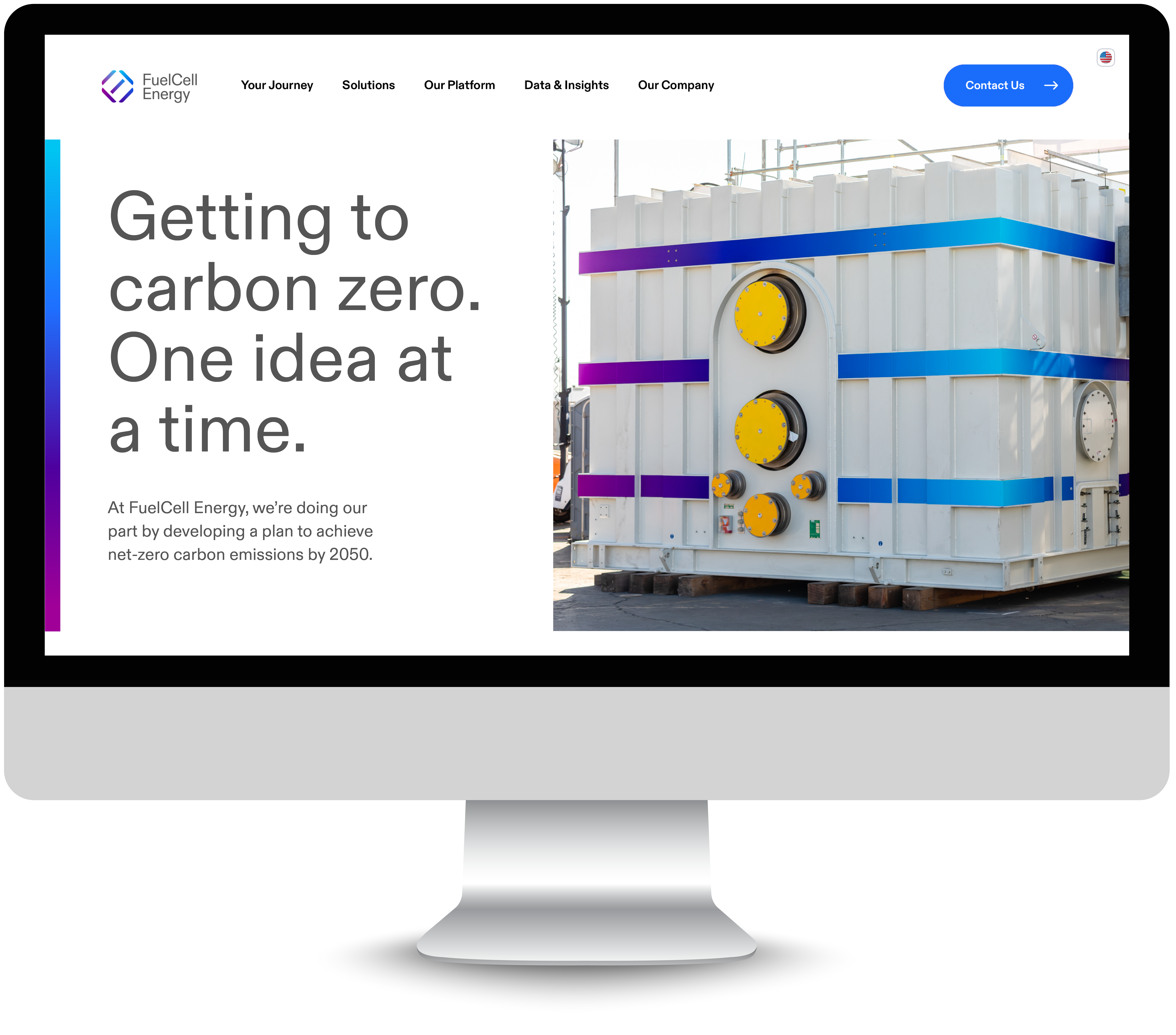
The creation of carefully conceived layouts reinforces the brand, enables content to be conveyed clearly and precisely and emphasizes the message.



Sustainable Development Capital LLP and FuelCell Energy Forge Strategic Data Center Power Collaboration Read More